Part 2: Wrangle the data
In this part, we’ll reshape the data into a more usable format and perform some preliminary data visualization to examine it. Watch the video and complete the tasks described below.
1. Reshape the data to visualize it
We want to plot the retail and recreation column for each Canadian province over time. We can do this right inside the spreadsheet.
This data is in long (or tidy) format. That means that all related variables are stacked in a single column. For example, province names in a single sub_region_1 column, rather than having their own columns.
Many chart tools don’t work well with long data, including Google Sheets and Excel. To make a chart, we need to reshape it into wide format, with the following structure:
- One row per date
- One column per province
- Retail and recreation numbers in the cells
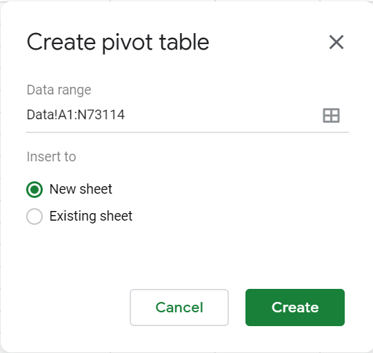
To restructure the data, we will use a Pivot table.
Note that the following steps are for Google Sheets; Excel but a similar approach (more info for [Google Sheets], Excel) and the following steps:
In Google Sheets
-
Create new pivot table (
>Data>Pivot Table). Insert it into a new sheet.
- For Rows, select the
datecolumn. Uncheck Show totals. - For Columns, select the
sub_region_1column. Uncheck Show totals. - For Values, add the
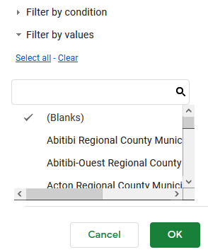
retail_and_recreation_percent_change_from_baselinecolumn. - For Filters, add the
sub_region_2column. In the Status dropdown, make sure only(Blanks)is checked.
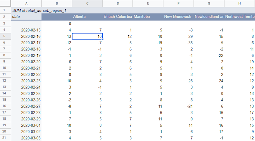
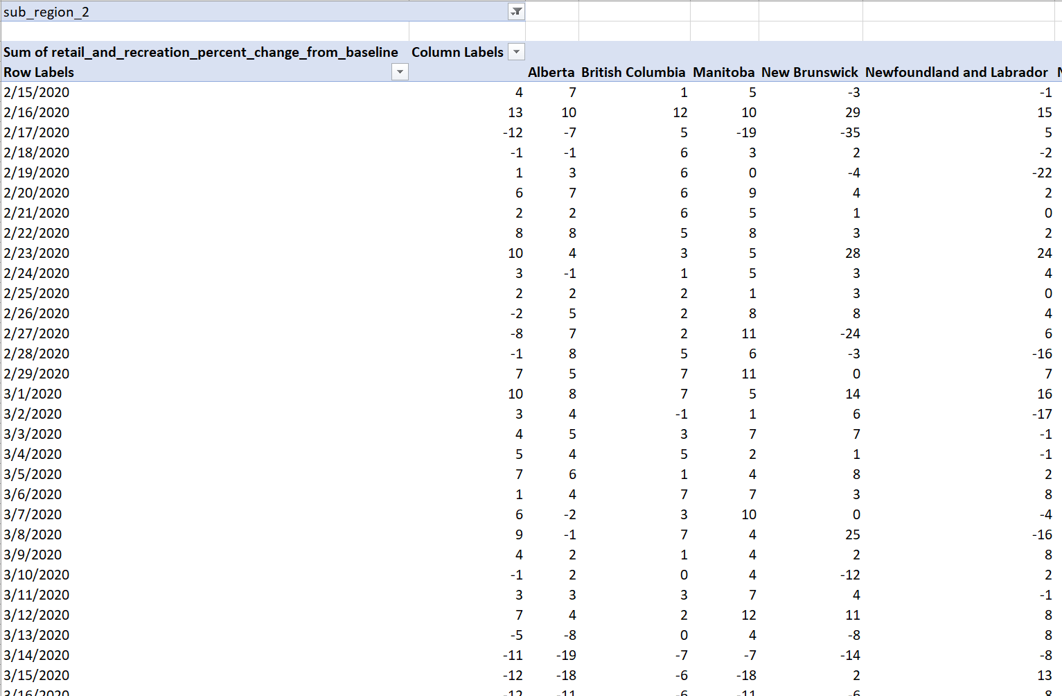
You now have the reshaped data ready to be piped into a chart. It should look like this:
In Excel
Create new pivot table (>Insert>PivotChart>PivotChart & PivotTable). Insert it into a New Worksheet. 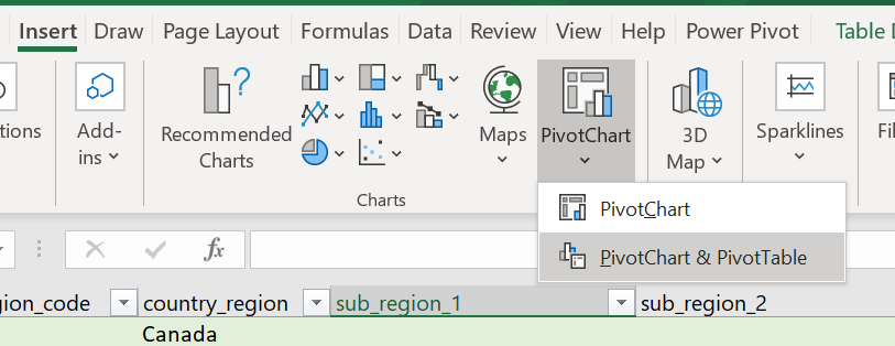
In the PivotTable Fields box, do the following:
- Drag the
datevariable to the Rows box. Click and removedate (Year),date (Quarter),date (Month), so that onlydateremains. - Drag the
sub_region_1variable to the Columns box. - Drag the
retail_and_recreation_percent_change_from_baselinevariable to the Values box. - Drag the
sub_region_2variable to the Filters box. - Click the dropdown symbol beside
sub_region_2in the variable list. Check the Select Multiple Items box, clear all check marks except for the blank entry (see below). Click OK.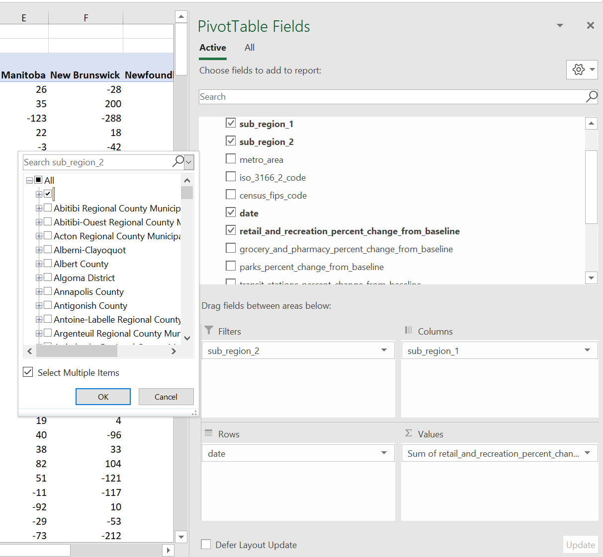
- Your PivotTable Fields box should look like the following:
2. Plot the data to visualize it
In Google Sheets
To create a line graph, do the following:
- Highlight the useful part of the pivot table, from cell A2 to the last cell (O300+). Tip: you can select the first cell, scroll down to the last one, hold Shift and select that last cell.
- Go to
Insert-->Chart. A line chart should automatically create, with one line for each province.
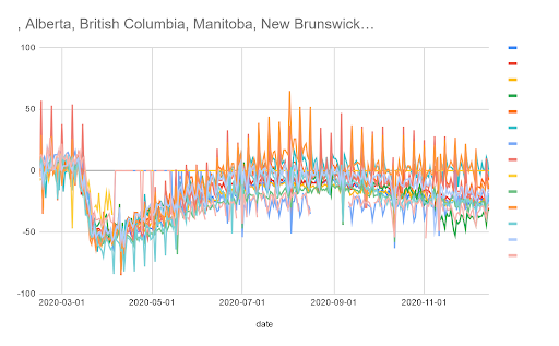
It should look like this:
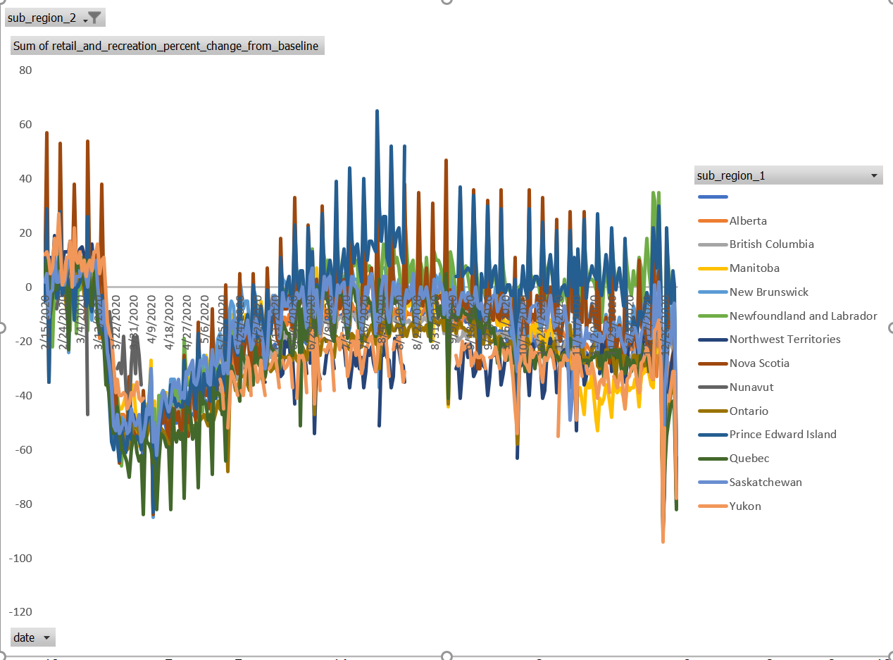
In Excel
A figure (bar graph) will have already been created within your Pivot Table. To turn it into a line graph:
- Right click on a white area of the chart and select Change Chart Type…
- Select Line and click OK.
It should look like this:
3. Begin to explore trends
There are some general trends that can be identified in the data, but overall, it is too noisy and not very helpful. There are too many overlapping lines and the weekend spikes make it hard to tease out the individual provinces (you read the data’s documentation to understand why this happens, right?).
This data needs to be smoothed using something like a moving average. We can do this in Google Sheets with formulas, but let’s move to a more robust data exploration tool: Tableau.
4. Exercises
You now have even more familiarity with the data, and a rough idea of what it has to say. Answer these questions:
- What are some issues that could prevent you from getting clear answers to the questions you came up with Part 1?
- Who would you go to to get clarity for these issues? What would you do if you can’t get that clarity?
Once you’ve completed the exercises, continue to part 3 to consider the potential flaws and limitations of the data.