Part 4: Probe the data
1. Explore the data visually using Tableau
Now that you understand the data deeply, you can start probing it for stories with more confidence. I suggest watching some tutorial videos of Tableau to get a basic understanding of the tool. It’s not complicated to learn. Watch the video and complete the tasks described below.
- Open Tableau Public and import the same CSV file you imported into the spreadsheet. Refer to the video for specific steps. Tableau works well with long data, so no need to reshape it.
- To recreate the same chart from the previous steps, drag the
Datecolumn to the Columns shelf. Tableau aggregates things to the largest unit, so it will group the date into years. Change that in the dropdown menu to the exact date. - Drag the
retail_and_recreation_percent_change_from_baselinecolumn to the Rows shelf, and thesub_region_1column to the Color shelf. - Now drag
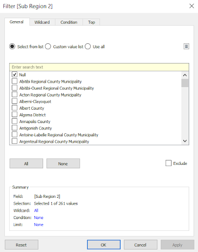
sub_region_2to the Filters shelf and be sure to only select the Null (or blank) rows.
The correct, filtered chart should look like this:
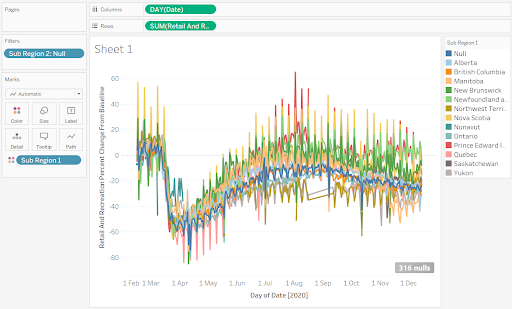
Still as noisy as before, but it was much quicker to make! Now we’ll make it easier to read using a powerful Tableau feature called a Table Calculation.
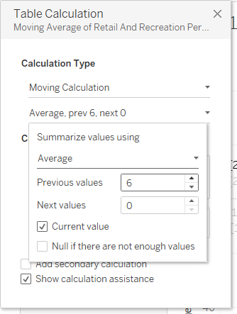
- Click on the drown-down menu of the Rows shelf and choose Quick table calculation -> Moving average. It will add a two-day moving average by default, slightly smoothing the lines.
- Change the moving average to a 6-day average.
- Open the same menu and choose Edit table calculation. In the second menu, change the value of Previous values to 6, then close that window.
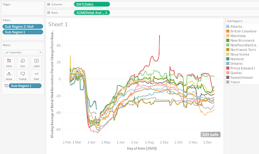
You should now have smoothed lines that are much easier to read and find patterns! You might also want to drag sub_region_1 to the Filters box and uncheck the Null box, so you only have lines for provinces.
And you even have a chart that you can include in your story, though I suggest giving the chart a design makeover. Charts are powerful storytelling devices, but they need to be well-designed.
How can you make a chart tell a story? Give it a descriptive title, helpful axis labels, maybe use a different colour scheme. Think about highlighting the province(s) you’re focusing on, giving them a strong colour that draws your readers’ attention to them.
2. Identify patterns that inform a story
This chart should start revealing some patterns worthy of further exploration:
- PEI’s line spikes in late August, goes blank, and restarts in mid September. Could this be a data anomaly that you’d need to ask Google about?
- Quebec had the biggest drop in outings to retail and recreation businesses in April, but surged faster than other provinces. What explains this? Perhaps an earlier onset of pandemic fatigue?
- Manitoba saw a sharp drop in December. What happened there?
- The Atlantic provinces all returned to baseline levels up until winter. Does this mean the Atlantic bubble was a success and allowed people there to live normally?
3. Exercises
What other possible story angles do you see? Write a one-paragraph pitch for each one.
Once you’ve completed the exercises, continue to part 5 to begin building a story.